Archives

EDITORIAL | oneindig schier


ph / Annemarieke van Drimmelen for Vogue Netherlands, November 2012

Flashback to the nineties, when logo's couldn't be bold enough and the underground venues were filled with uncovered bellies and Palazzo pants. This attempt of modernism in the deserted wasteland of the (not so tropical) islands of Holland is mesmerizing. Makes me want to book a one-way ticket to endless beaches under heavy clouds. And now the main question: To crop or not to crop? I have to answer with no. Don't want to miss out on all the good things of December (FOOD).

BLOGROLL | spare time virtuosity

Camilleovertherainbow | Camille, Paris
Oh yes. She is definitely a 'blogger-blogger'. She owns a pair of the classic Nike Free Runs, was one of the first to rock the baggy leather pants and has ongoing legs that are on everybody's wishlist. The half-French, half-British Camille also has 'it', the unknown chromosome that adds a little bit of extra nowness to every outfit. She is my latest find in the blogosphere, and certainly a source of inspiration.

LizaChloe | Liza Chloe, Paris/Amsterdam
With her easy sense of style and typical Dutch sense of functionality, Liza Chloe is living the dream in Paris. Her always surprising face-expressions mismatch her sober outfits in a fun way. And what's not to love when dark lips, high buns and Margiela's garments are spread over the pages? Liza's blog is worth a stop-by for anyone who needs dynamism and energy in greyscale.

The Haute Pursuit | Vanessa Hong, Beijing/HongKong/New York
Since my new hair length is completely based on some pictures of The Haute Pursuit I showed my hairdresser, Vanessa couldn't be left out in this top five. I adore her effortless basics, the simple and natural posing and did I already mention her hair? I dare to say that The Haute Pursuit has an even amount of the 'Cool Kid'-factor as A. Wang. Bang!

WeHaveNoStyle | Iris and Daniel, San Diego, California
Iris and her 'spouse in style' Daniel have the refreshening perspective and in-deep analyses that everybody should take a sip off now and then. Their blog is radical different from the well-known lay-outs and combines old with new, eclecticism and optical illusions with innovative techniques. It contains all the miracles of Photoshop you never thought you would ever be using...

WeThePeople | Jessie Bush, Sydney
I prefer the honest and personal take that Jessie has been taking lately. I want more of her cropped hair, mesmerizing travels to Paris and Asia, more of her short trousers and heels mix. She has the talent to capture the most unusual mixtures of people, clothing and accessories. Always under the burning Aussie sun.

MY PICKS | resort collections pre-fall 2013

ph / style.com, collage by me

Imagine me behind a sowing machine. Had a good laugh?This will be my (nearby) future, so I'd better absorb some inspiration from the latest Resort collections for Pre-Fall 2013. God, 2013 is almost here, and it keeps getting better! My picks are obviously on the greyscale, even though the collections contain loads of the darkest burgundies and blacks, hitting the gothic side of the colour spectrum.

I went for the other end, full of camels (the colour, not the animal), faded whites, washed out pinks and a good old jersey knit. I could write poems on the lovebaby of camel and grey. The masculine and oversized shapes are here to stay (did they ever leave?), but adjusted with lower, feminine necklines. Interesting to wear when negotiating about higher wages without losing yourself on the tacky side (leopard and push-up bra's, rawrr). I kept pasting pictures in the collage, but it looked like some kind of Paint-art. So I left the best ones out... See Philip Lim, Calvin Klein and Diesel Black Gold for yourself here.

From left to right: Narcisco Rodriguez, Bottega Veneta, Alexander Wang, Reed Krakoff, Proenza Schouler

INSPIRATION | lazy sunday


ph / Mugler Resort 2013, C. Maxwell Morris, Sophie Gerber by Ben & Zie

"I think perfection is ugly. Somewhere in the things humans make, I want to see scars, failure, disorder, distortion." — Yohji Yamamoto

Asymmetry, natural irrelevance, unexpected behavior. Against all odds, silent rebellion. These three pictures got stuck in my head to never disappear. Just a slight adjustment, such an innovative perspective. Have a great Sunday!

COLOUR PALETTE | a shred of blue


ph / various Tumblrs + own

What's your favourite colour? Standard question in the endless list of 'favourites' in friendship books. After my favourite pet (dinosaur), my favourite job-to-be (opera singer/lifeguard/animal vet) and favourite music (Spice Girls, no doubt about that), there was the colour-drama. White and black are no colours, holographic does not exist in rainbows and neither is glitter. So I ended up with blue. As with Van Gogh, I also had my blue periods. Sometimes it was greyish blue, as a cloudy day in February. Sometimes I liked blue jokes more. But Comme des Garçons Rei Kawakubo got me into this kobalt blue shade. My new favourite.

DESIGNER | ricardo dourado

Something captivating, bright orange with hints of shimmering silver. Something contrasting, a mixture of massive inks and unadorned tunics. Something so rugby, Asian and punk all-in-one. That something is Ricardo Dourado.

His tumblr shows gifs from his latest 2013's show, self-portraits in the back of a posh looking car, grunge-influences in bright colours and random poetry about deconstruction. Does it provide a clear view on the man himself? No, but it helps understanding his fascination with odd movements and inconvenient combinations.

The Spring show is based on the orange used for prisoner's coveralls, as well is the inspiration for the giant tattoos. Angry eagles spread their wings on the chests of tough looking males, walking up and down the catwalk in black New Balance sneakers. I imagine an accompanying hardcore beat, full of anger and rage. Shirts are rather oversized and the three-quarter length pants also don't come in size S. Best part are the leather coverups, clearly inspired on bullet proof vests. Top it off with a sceptum and a wall of barbed wire, and you just got a step closer to the Dourado's thinking process.

UPDATE | the time of must-do's is over

It seems like ages ago since I logged in on Blogger! My pile of to-do's and must-do's grew until it hit the ceiling, and finally disappeared when I passed my stylebook assignment last week. Not to mention the fights with copyshops I got into... (When do you need the book to be printed? Eh, like now?). It took me glue, sweat and almost tears, but it is worth the extra spare time afterwards. Time well spent! Radiohead's I Might Be Wrong somewhere in the background, hours of crawling under the warm blankets of a double bed and a thin layer of snow covering the streets. So far my Yoko Ono Plastic World. I will spend every minute from now on behind a sewingmachine, since I have to deliver a prototype dress for the institute and I can only work with plastics. Nineties PVC-dress, I hear you thinking? Things always end up 180 degrees from my original plan, so we'll see.

WISHLIST | december II

ph / Personal

It feels so incredibly materialistic and displeased to make a wishlist. I am blessed with a caring family, the best boyfriend I could ever hoped for and an challenging education in fashion. However, listing things is such a nice spare time thingy (even if I should be working on school)!

1. Minimalism in Fashion book | Minimal life, maximal inspiration!
2. Daniijo iPhone case | I am still wandering around with a rubber 'chocolate'-case.
3. 360volt Tripod | The vintage tripod that will suit my home-to-be perfectly!
4. Iittala Vitriine | To store my precious jewelry, or keys, or... 
5. Elephant Magazine | Collecting anything independent. Industrie, Frame, Surface!
6. HAY Kaleidoscope | Brilliant displays to mix-and-match.
7. Zara City bag | Since my other bags keep giving up.
8. M.A.C. Matte nude/burgundy lipstick | For long-lasting kisses on my boyfriend's cheek.
9. Lightningfactory perforated wallet | Delicate, simple and hand-made. 

EDITORIAL | Wait and see


ph / Nicole Maria Winkler for Volt Magazine

Oh, how subtle are the details. Hidden in a remarkable fabric (do I spot Tyvek?), shown through minimalistic accessory and noticed in the play with light and colour. There is a modern grunge-appeal throughout the visuals, from the grumpy attitude to her elongated, messy hair. A distance, a "no I won't". Volt Magazine did a brilliant job, in my honest opinion.

FILM | Phoebe English


SHOWstudio presents | Phoebe English AW2012

As I am dealing with looking for my style in every aspect of today, I developed a more clear vision on historical themes used as reference in advertising, fashion and film. In this Phoebe English short clip, the mirrored, kaleidoscopic feeling is attractive, next to the fact that she uses surrealistic effects throughout the film. How clever is the shot with the two black head-pieces? It draws the attention to the upper half of the body, while the proportion and scale is lost. Take your little lost moment today to see what SHOWstudio have come up with and be impressed!

EDITORIAL | Layering like a Hero


ph / Andrew Vowles & John McCarty for Hero Magazine

Layering is often a keyword in trend forecastings. Top off your leather jacket with a woolen cape, bring an extra layer in by adding that collarpiece and well, if we're here anyway, let's put a waistcoat on top of it. This editorial does layering light. The brilliant use of a semi-transparent shirt brings more wit and play to men's fashion. I just can't help the associations with a mosquito net...

BRAND | M2MALLETIER

ph / originals by M2MALLETIER, collage by me

Autumn kicks in, and so is my urge for cocooning in thick woolen knits, accompanied by some goodies from M2MALLETIER. Melissa Losadaand and Marcela Velez stated that they were looking for the "ultimate balance" in day-to-day handbags. They came up with "the needle", a handle unlike any other that is inspired by medieval medical instruments. "We offset all that was classic with the handle's surrealist quality," Losada explains. "I guess that's what you get when you stare at iron rods all day." Wether it was used as painful teeth-remover or as a prothesis for your elbow, "the needle" looks best on a handbag a few hundred years later. Thank God for history!

DESIGN | Renewed Tumblr

ph / myself

My summer memories slowly start to fade and the woolen yarns surround my body. As the cold breath takes over, it is time to adjust your wardrobe. And in the same way a new wardrobe changes your personal atmosphere, it was time to recreate the vibe of my Tumblr. New coat, new dye, new design. Serendipity is Revolution has become more geometrical, graphical, personal. What is your opinion?

NATURE | From above


ph / Gerco de Ruijter

“Neither mine nor other people’s prospects seem particularly pleasing just at the moment, and I have fantasies of going to Iceland, never to return. As it is, I tell myself not to remember the past, not to hope or fear for the future, and not to think in the present, a comprehensive program that will undoubtedly have very little success." - Floating Worlds: The Letters of Edward Gorey & Peter F. Neumeyer

In the middle of this ice-cold inspiration process (I am working on a research-project on Russian folklore...) these photographs of Gerco de Ruijter encourage me in my thinking. Distance, despair, suspicion, absence and anonymity are the keywords for both the mood of my subject as the photographs above. So, let's bring in the inspiration and toast with a bottle of vodka!

ART | Anish Kapoor

collage and last photograph / Personal

A small room. Concrete floor. White walls. A perfect round circle in the deepest purple on the floor. Flat. Just a circle, until someone puts her hand in there. The circle is no longer two-dimensional, but a hole in the floor. The effect of incorrect perception is one of the main themes that shows through the work of Anish Kapoor. And colour, from the brightest red that sucks you into a wall to the deepest blue, that doesn't reflect a thing because of the lack of pigment. 

I saw the incredible work of Anish Kapoor in museum De Pont in Tilburg last week. What seemed to be a giant room filled with mirrors that morph you into something alienating, was actually art. But not the only the artwork was impressive. De Pont is established in an old wool factory, including original red bricks, giant halls and brilliant lighting. Kapoor's incredible installations look even better in the industrial surrounding, too bad that Tilburg is for most of us not really what you call central... However, worth the endless train ride!

AMFI | Inspiration Book

ph / Personal

Excuse me, Inspiration Book, I guess I sort of underestimated you. Last Friday was the deadline of my first assignment on the Amsterdam Fashion Institute. The past few weeks were a concatenation of sleepless nights, endless to-do lists, take away sushi and glue sticks allover the place. I have never put so much effort, heart and soul in something. This is the result, an A3-book with four themes; arrangement, alienation, spacious and anonymity. Each theme consists of several visuals, graphics and words, accompanied by captions that explain my vision and the connections between images. Work hard, play hard. But not without result: I passed!

STREETSTYLE | Pump up the volume

Ph / Diego Zuko Harper's Bazaar

Giovanna Battaglia and Elisa Nalin both went for shape and volume during Paris Fashion Week. The stiff materials form bulky shapes and boxy tops, which we saw in the spacious Balenciaga show last Fashion Week as well. I love how Giovanna spices up her simple grey dress with a colourful scarf and matching mirrorglasses. Elisa took it all away: multicoloured and multistriped. So, you have some good examples now. Throw your bodycon dresses away, bulky is the new sexy!

TREND REPORT | Fashion Week Favourites I

White Lights
Alexander Wang completely smashed it with his see-through collection full of floating jackets, dresses and even trousers! I predict that the minimalist gladiator heels will be sold out in no time. Just another pair of brilliant shoes... Other white favourites include the designs of Neil Barrett, who keeps it neat and simple again. This pair of Palazzo trousers in the mix with a stiff oversized jacket is daring, but he can pull it off. Then we have Diesel Black Gold, who gave their show a golden edge. Best outfit was the coated jeans in combination with a plain blouse and fringe heels.

Blue jeans, white shirt
All sorts of blue came across the catwalks, from darker hues to babyblue, from navy to faded electric blue. 
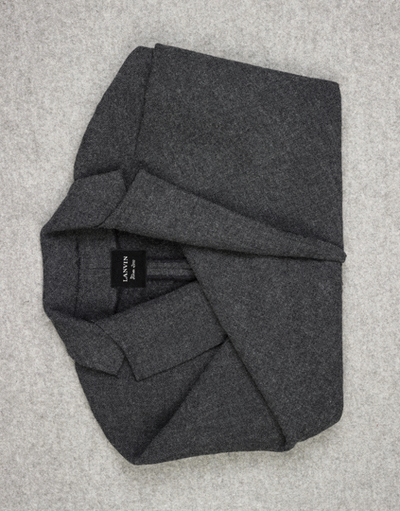
Haider Ackermann nailed it with this suit that looks like it is inspired by the Japanese art of folding. The sleek cut is perfect, and the materials are nicely contrasting. Matthew Williams chose for a more colourful way of combining, with loads of embroidery, faded blues and greens and an overall nature look. Haizhen Wang was in my opinion the best of Fashion Fringe, the London equivalent of Project Runway. Graphic prints and patterns, geometrical compositions and tough models. He's a newby ánd a Wang, so my expectations are high...

Original photographs belong to Style.com

ART + ARCHITECTURE | Espen Dietrichson


ph / David Desaleux

On my hunt for inspiration, I criss-crossed the field of architecture. The use of textures, constructions and various materials seem to have more connection with fashion than you would think at first sight.

These photocollection of Espen Dietrichson are half manually, half digitally made. Floating walls and steps create interesting visuals that are alike exploded axonometric diagrams drafted by architects. I found the stripped buildings incredibly brilliant, they have a certain mystery and jaw-dropping effect. Want to see them yourself? The levitated buildings are entitled 'Variations On a Dark City' and are exhibited at the Galerie Roger Tator in Lyon.

MONDAY | A gif a day...

Scheltens Abbenes
ph / Scheltens & Abbenes Studio

Sometimes, a monday-morning only needs a small gesture to brighten up. I stumbled across the work of Maurice Scheltens and Liesbeth Abbenes yesterday, and immediately saw a gif coming up when clicking trough this set of photographs. They did amazing work for Balenciaga, The Gentlewoman and Dazed & Confused and their website contains one of the finest graphic designs I've come across lately. Just a little tip to brighten up your Monday. Have a good one!

DESIGNER | Martina Tiefenthaler

ph / Martina Tiefenthaler, Indie Magazine no. 29

When flipping through an old edition of Indie Magazine, I noticed a whole bunch of post-graduated fashion students. New talent and vision can be really refreshing, especially when it's innovative, futuristic and eclectic. Meet Martina Tiefenthaler and her 022010M01 collection, a golden oldie from 2010. The powerful silhouettes, material experiments and splashes of neon create an interesting paradox.

Inspiration for this almost entire white collection is a true mix of influences: from Grace Jones to African tribes, from sportswear to geological strata. "My collection is all about fabrics, cuts and the absence of parts and unneeded details", as Tiefentaler stated in Dazed&Confused. With her abstract view on clothing, she won the INDIE Magazine Award 2010 and an 8-paged editorial, of which you can enjoy in the upper left corner. Visit her website for the other visuals from the shoot.

WORDS | Vision on inspiration

ph / Serendipityisrevolution.tumblr.com

"Inspiration is what positively adds something to you current state of thinking. Inspiration will make you open up to different ways of thinking, different angles of an object, different approaches to a problem. It is the base of all creation. It can be found in nearly anything personal; from a simple gesture, impressive typographic skills or just some words from your old, wise grandma. Inspiration makes your horizon broader, your mind more open and your creative work better. It is, in brief, what develops your idea, feeling or passion. It makes you go forward."

Eveline Koppejan | 4 September 2012

MUSEUM | EYE Film Institute

 ph / Personal: dalmatian printed pants H&M, brogues Primark, leather jacket ZARA, sheer blouse H&M

One of the best parts of studying at a Fashion Institute is visiting museums. I was planning on seeing the NIMK, but ended up in the brand new EYE Film Museum across the IJ. Personally, I liked the exterior more than the current exhibition about Stanley Kubrick. It was fascinating though to read about the branding ideas behind A Space Odyssey. Stanley gave forty manufacturers the chance to do some strategic product placement. Vogue did the styling, IBM was responsible for the computertechniques. An interesting take on how to make money with your cult film!

The outside of the EYE is spectacular in every angle. The pattern on the fancy white material, the grey bricks and of course the futuristic shape and special site make the building worth the visit. Especially if you can drink a cappuccino and enjoy the brilliant view on Amsterdam across the water!

EYE Film Institute
IJpromenade 1 Amsterdam

OUTFIT | Would you like a spacecream?

ph / Collage made by me

This is major Tom to ground control,
I'm stepping through the door
And I'm floating in a most peculiar way
And the stars look very different today
David Bowie | Space Oddity

Gradient T-shirt | COS Men
Ponyskin wallet | Allsaints
Out of Space Trousers | COS
Croco Bomber Jacket | Topshop
Holographic nail polish | Chanel
Heels | Nowhere for Nelly.com

INSPIRATION | Contrast, confusion


ph / Various Tumblrs

Well, hello! Last week was one heavy whirlwind of impressions, new faces, farewells, small parties and loads of inspiration. I said goodbye to some and hello to others, learnt new ways of being creative and joined the visual forces for some nice artwork. In brief: these were my first days at Amsterdam Fashion Institute. First assignment? Make an inspiration book. I've filtered my favourite maps and made a selection of current inspiration. Contrast, semi-sheerness, confusion.
 

Copyright 2010. All rights reserved.

profile links service | organic wordpress | Blogspot Template